Commure and Athelas are joining forces to form healthcare’s next-generation operating system. Read the announcement.

A Merger of Equals
Operating System Overview
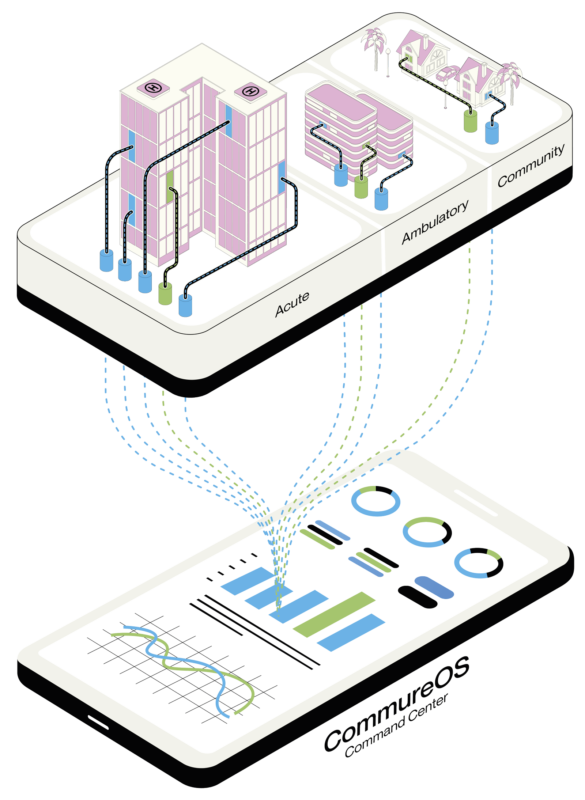
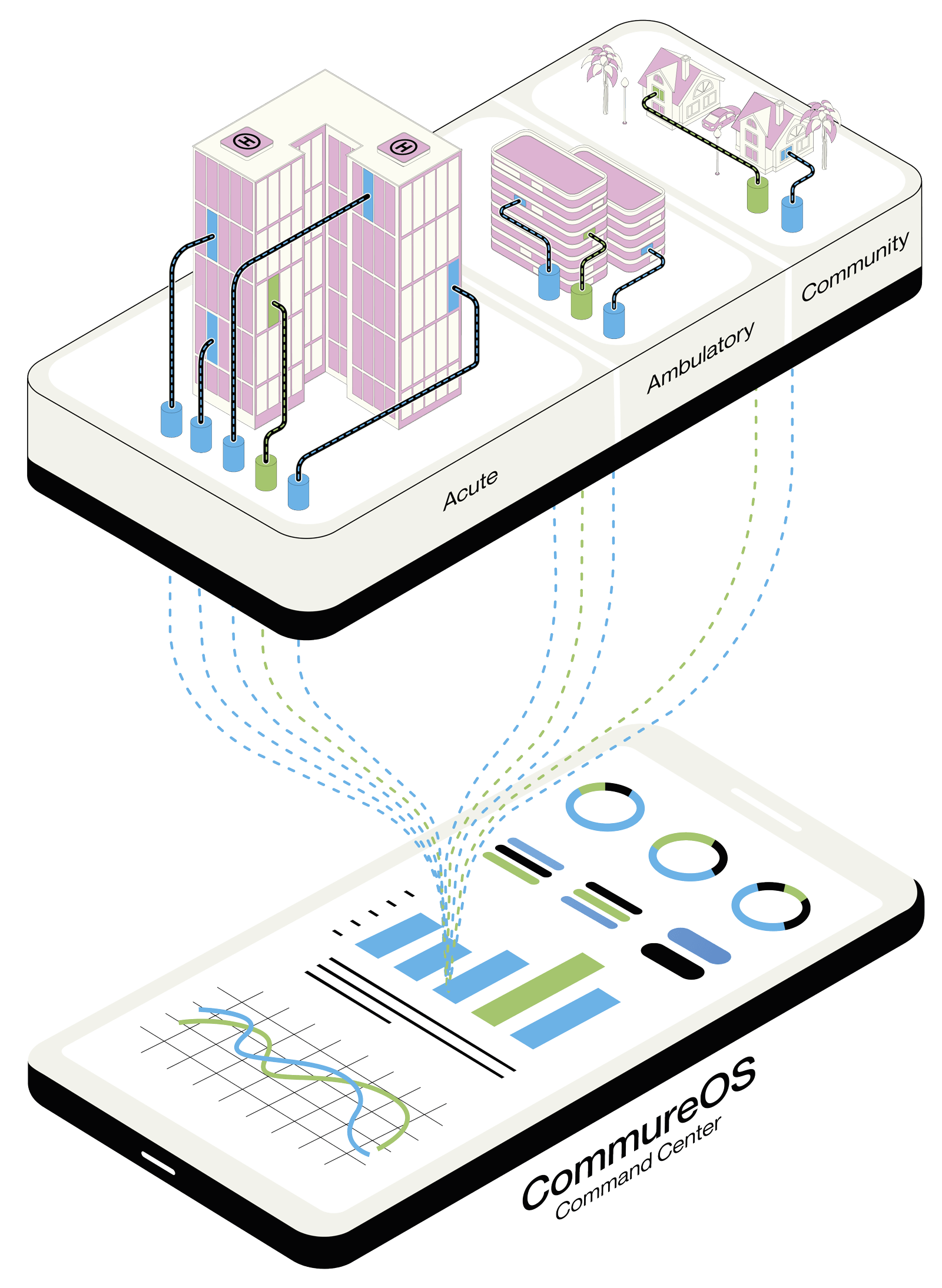
With CommureOS, you have the full force of healthcare’s first operating system at your fingertips, allowing you to surface data-fueled insights and create or customize workflows at lightning-fast speeds — all in one single command center. You chart your course — we’ll champion your journey every step of the way.

Sorting through slews of data confined to nearly impenetrable silos makes key insights as discoverable as needles in data haystacks. With so many disparate systems and data streams to manage, how can health systems be expected to take meaningful action on their data in the moments that matter?
Whether you want to drive digital patient engagement, power health at home, or free your workforce from the weight of disjointed tech, CommureOS can meet your needs — and unlock new opportunities.
An average health system today juggles:
18
different EHRs
and
50-100+
point solutions
Sources: HIMSS, Symplr
Your tech is complex — but it doesn’t have to be. We’ll simplify your tech stack so you can innovate and build with ease from one level playing field.
Command your entire tech stack by connecting existing and new solutions and bringing together your most essential data using our vendor-neutral and multi-cloud model.
Free your data from their silos and surface the critical information your workforce needs, when and where it’s needed, to power recommended clinical and operational actions.
Design, deploy, and reuse clinical and non-clinical workflows for any need or use case with our healthcare-native and modular building blocks in a matter of weeks — not years.