Better Care Starts With Safer Staff. Learn more about Strongline Pro .
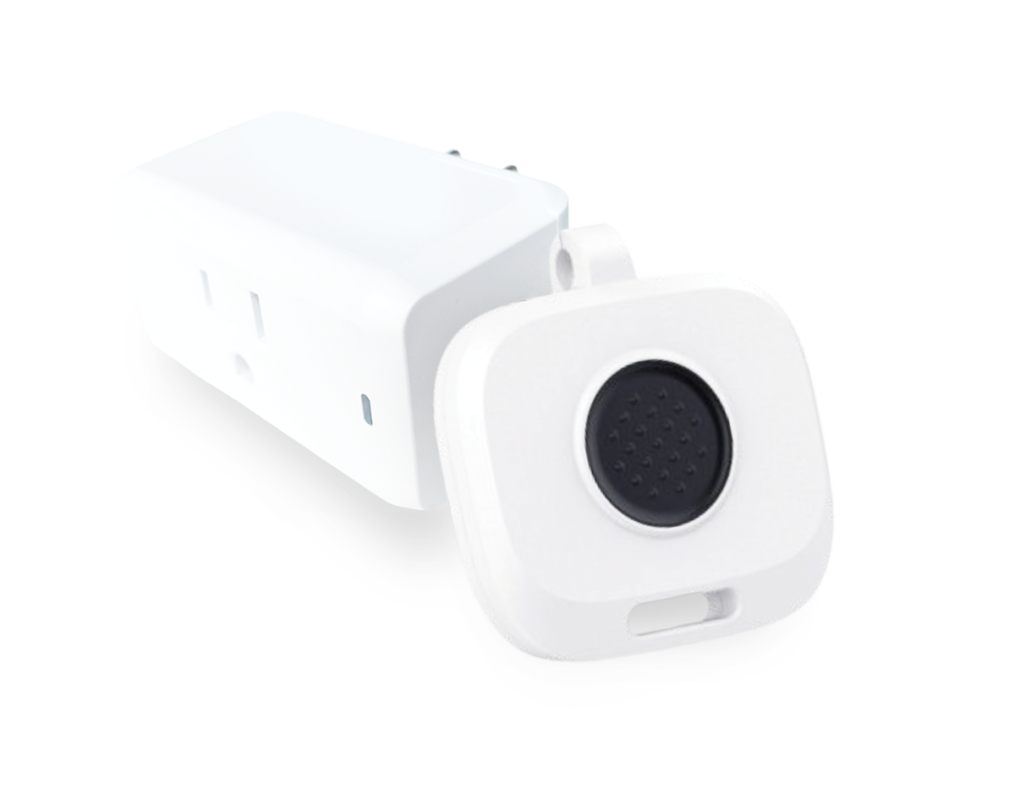
Meet Strongline Pro
The small safety badge with the big impact.
This powerfully simple duress-alerting badge empowers healthcare workers to call for help when they need it. Instantly, silent alerts with the employee’s name and real-time location are sent to security and nearby responders to step in and de-escalate potentially violent situations.